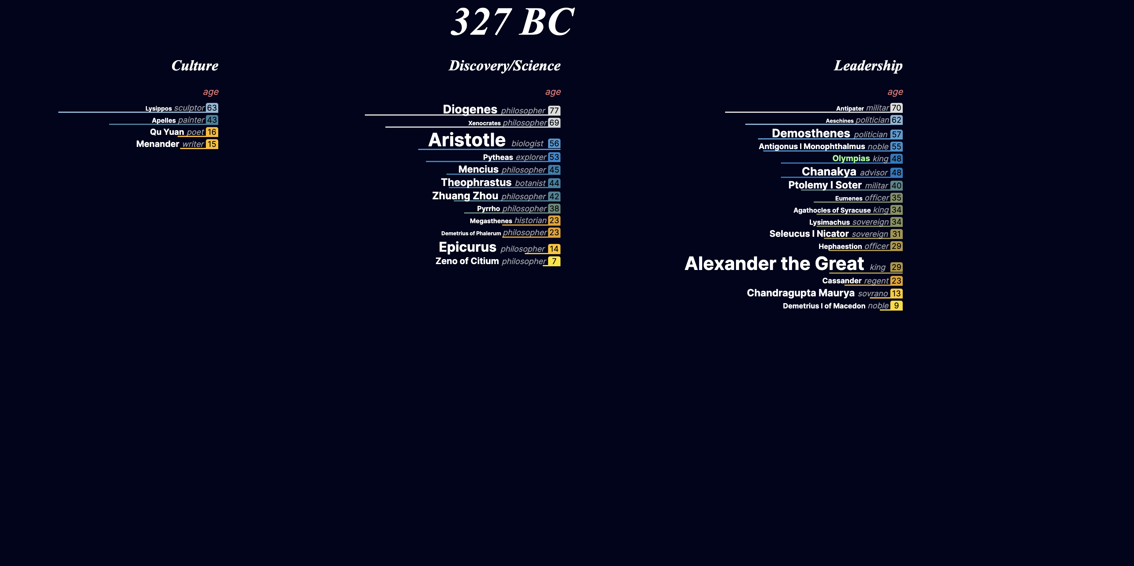
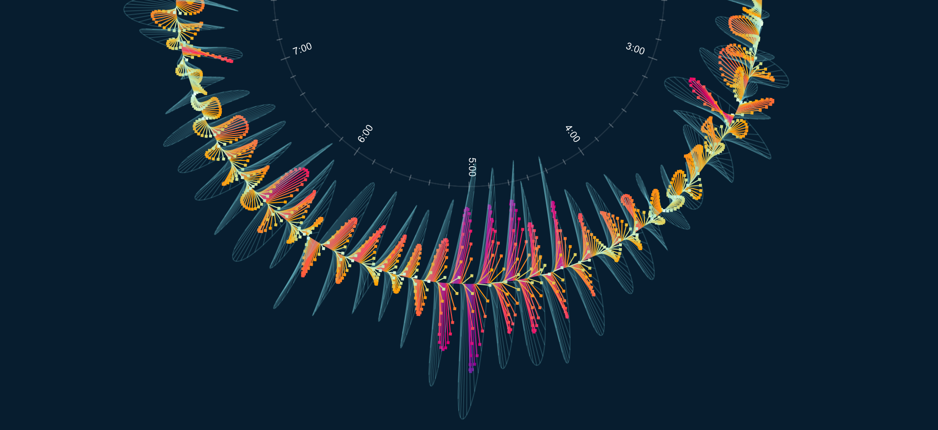
TULP interactive

TULP interactive

Parallel Lives

An alternative view on a timeline of notable people

Based on a database of notable this small interactive experiment shows an alternative view of a timeline: who was alive at the same time, and how old was someone at each specific year.

Parallel Lives

University of Innsbruck

Education & Digital Capitalism

Visually explore meta data and cross references in annotated texts about education and digital capitalism.

An interactive visualization that allows students and researchers to explore meta data and cross references in annotated texts about education and digital capitalism.

Education & Digital Capitalism

World Bank

SDG Atlas 2023

The online version of the Sustainable Development Goals Atlas 2023

Award wining online version of the Sustainable Development Goals Atlas 2023, telling stories about the state of the world and the progress towards the Sustainable Development Goals (SDGs).

Ernst von Glasersfeld archive

The Hague Center for Strategic Studies

HCSS Boardroom

Explainer data animation to support a masterclass presentation on the risks in geopolitics of semicondutors and critical resource materials.

Explainer data animation to support a masterclass presentation on the risks in geopolitics of semicondutors and critical resource materials.

HCSS Boardroom

University of Innsbruck

Ernst von Glasersfeld archive

Visualization of the archive, annotations of his works and library of German philosopher Ernst von Glasersfeld.

Visualization of the archive, annotations of his works and library of German philosopher Ernst von Glasersfeld

Ernst von Glasersfeld archive

World Bank

WDR Report 2021

The Data Stories companion website of the World Development Report 2021.

Together with Maarten Lambrechts and Beyond Words Studio, we have developed the Data Stories companion website for the Word Development Report 2021.

World Development Report 2021

World Bank

SDG Atlas

The online version of the Sustainable Development Goals Atlas 2020

Together with a large team of professionals, we have developed the online version of the Sustainable Development Goals Atlas 2020. I worked on the visuals for SDG10 and SDG17.

Howard Hughes Medical Institute

Fly Brain

An interactive visualization that helps researchers communicate neuron connectivity of the brain of a fruit fly.

An interactive visualization of a connectome that helps researchers communicate how individual neurons in the brain of a fruit fly (Drosophila melanogaster) are connected to each other

Fruit fly brain

Microsoft Research

OTDD

Measuring dataset similarity using optimal transport

Together with BloomingData we designed and implemented the interactive visuals for the online post on Microsoft's research paper of "Measuring dataset similarity using optimal transport (OTDD)".

Measuring dataset similarity using optimal transport

TULP interactive

COVID-19 Spreading Rates

A ‘real-time’ simulation that shows how fast COVID-19 is spreading in each country.

This simulation gives you an intuitive ‘feel’ for how fast COVID-19 is spreading in every country. See it, and hear it, in ‘real-time’!

COVID-19 Spreading Rates

Capital Advertising / Vislift

Vislift

An interactive visual experiment that based on mixture of fish tracking data

An interactive visual experiment based on a mixture of data collected from fish passing by through a Smart Visift

Vislift

NS

Train traffic in The Netherlands

An average working day of train traffic in The Netherlands

Interactive animated 3D visualization of train traffic on an average working day in The Netherlands as part of the NS 2019 annual report.

Train traffic in The Netherlands

TULP interactive

2019 vote EU

An alternative EU elections vote matching

See where political parties of the EU 2019 elections overlap and differ with each other, and you. You can only select opinions and combinations of opinions that parties share.

2019 vote EU

TULP interactive

On Time Every Time

One day of train movement simulation

A simulation of one of the busiest days of Dutch train traffic that distorts the map based on how well-connected stations are.

Figshare

Coral and Fish

The state of fish population and coral in the Pacific Ocean.

An interactive exploration of the change of coral and fish population for islands over time in the Pacific Ocean. Based on data from NOAA.

European Space Agency

Gaia Stellar Family Portrait

Gaia 1.3 billion stars

An exploration of the Hertzsprung–Russell diagram, using data from the second data release of ESA’s Gaia mission.

Deltares

World Water Atlas

Stories about living with water

In collaboration with De Voorhoede, we have developed a website and visualization that allows users to explore stories related to water issues world wide.

Chef James Briscione

Flavor Matrix

[TODO]

A revolutionary new guide to pairing ingredients, based on a famous chef’s groundbreaking research into the chemical basis of flavor.

Scientific American

Eclipse Spiral

Eclipses to the year 3000

A radial eclipse calender that shows eclipse occurrences for the next 3000 years.

European Space Agency

Star Mapper

The Hipparcos star catalogue

The ESA Star Mapper is a visualization tool that allows you to explore various aspects of more than 60.000 stars from the Hipparcos mission.

TULP interactive

TravelTime

Variations in car travel time

A data visualization animation that shows 1 day of traffic in the Netherlands at 1 minute intervals. Road segments are offset based on the deviation from assumed normal travel time.

Scientific American

Exoplanet Census

New exoplanets expected to be found

A print graphic showing the new exoplanets expected to be found with the new TESS and CHEOPS space satellites.

Nature

Trillions of Trees

World wide tree densities

A visualization of a new research that shows the estimate of 3.04 trillion trees in the world. The visualization was used as the cover image of Nature magazine, and also an animation was produced from this visualization.

TULP interactive

Spirograph

Randomly generated spirographs

An exploration into the aesthetic beauty of spirographs. Random spirographs can be generated and viewed in 2D and 3D.

RWDI

Highrise Buffeting

Movement of a highrise building and its damper in a storm

A visualization that shows an engineering simulation of the movement of a supertall building and its tuned mass damper during a windstorm over time.

Google

Inaugurate

U.S. presidential inauguration speeches compared.

A visual exploration of historical Presidential inauguration speeches through Google search data.

Visualized

Goldilocks

Potentially habitable exoplanets

Created for the Space themed opening night of Visualized 2015, this visualization shows various aspects of exoplanets considered to be potentially habitable, also known as Goldilocks planets.

TULP interactive

Snowflake

Uniquely generated snowflake

A unique snowflake that is generated based on text. Text can be customized and the snowflake can be shared as seasonal greeting with friends and family.

Scientific American

Human Gene Expression

Human vs. mouse brain activity

Research shows that the activity in the brains of mice and humans are different, so are mice good test subjects? This is a part of a visualization that shows the difference in brain activity in mice and humans.

Scientific American

The Flavor Network

Foods that go well together

A recreation of a network visualization from a research paper, that shows which ingredients go well together, based on the number of compounds they share.

city of Den Haag

Municipality Reports

Reports of municipality problems

An interactive visualization built for the local government of Den Haag that allows them to explore municipality issue reported by citizens about public spaces in the city.

Natural Recall

Edible or Medical

Plant uses for humans

A network visualization that shows the interconnection between humans and plants. This visualization is an artistic approach to show the many uses of plants for humans, based on the Plants for a Future dataset.

Nielsen

Corporate identity

Dataviz as part of a corporate identity

As a data intensive organization, Nielsen wanted to have data visualization become part of their corporate identity. Images as these were designed and generated so that they can be used as aesthetic illustration in brochures for example.

Scientific American

Socio Patterns

Transfer of disease in a hospital.

Based on a research on so-called nosocomial infections in a hospital using RFID tags, this visualization shows a network of groups of people who have had the most close interactions. People with many contacts are more susceptible to transferring diseases.

TULP interactive

Close Votes

Voting similarities between cities

A visual exploration of the similarities between the voting results of cities of the Dutch national Parliament elections in 2012.

Hogeschool van Amsterdam

Amsterdam Campus

An interactive 3D map of the creative industry in Amsterdam

An interactive 3D visualization of Amsterdam that shows 4 creative hotspots in the city, and was shown during the launch event of the formal collaboration between 3 universities in Amsterdam.

TULP interactive

Ghost Counties

Housing market in the U.S.

The winning entry for a visualization contest to represent statistics of the U.S. housing market in a non-conventional and creative way.